Intsuka
Branding our origins
The Brief
The word ‘Intsuka’ means ‘point of origin’ invoking the notion of where one comes from. As a metaphor, the idea of origin speaks of a beginning, a core point from which all things flow. A source, an epicenter, a wellspring of life and movement. Intsuka is a broad company covering numerous interests in different corporate sectors. As such the design needed to be simple, clean but striking enough to stand out.
The Outcome
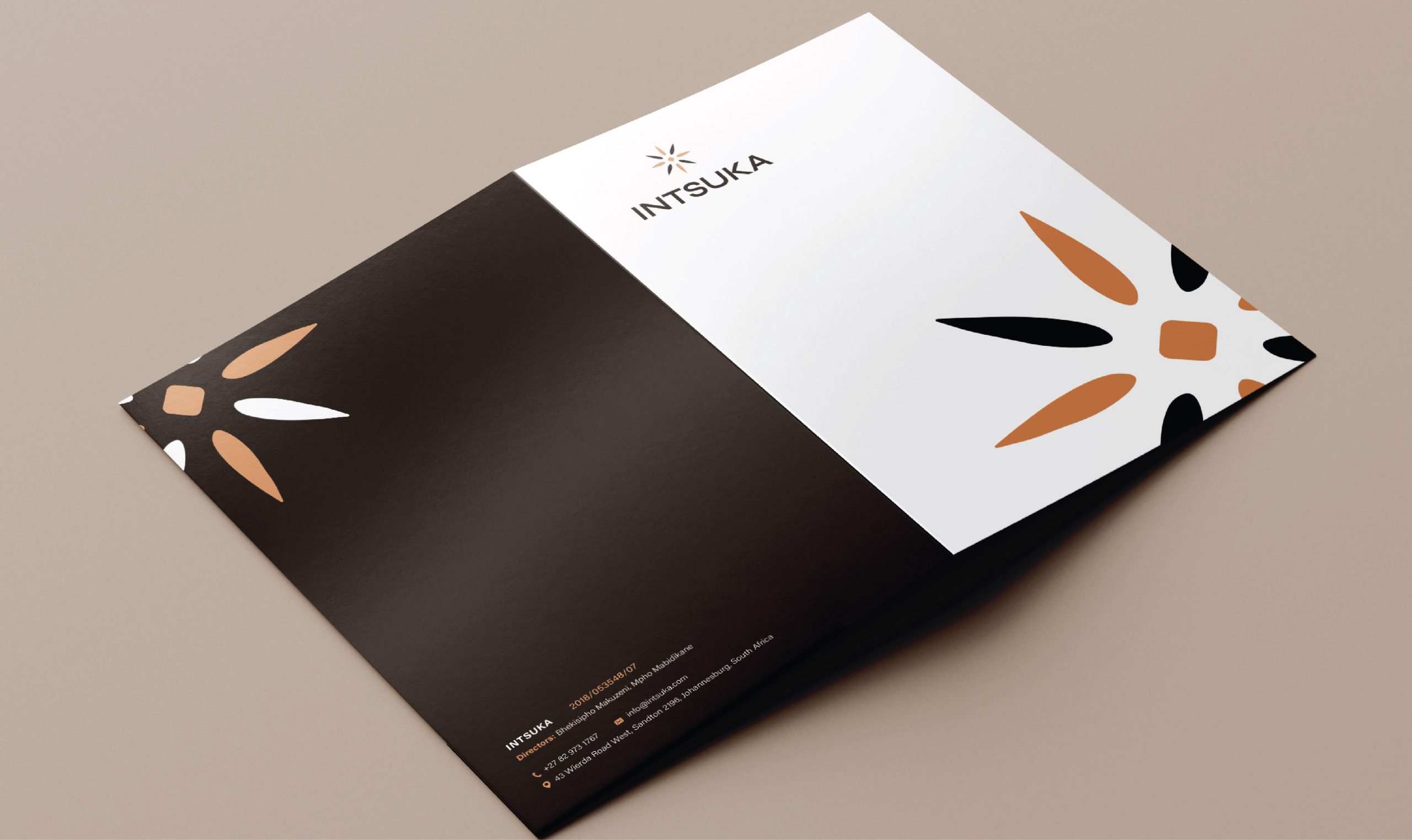
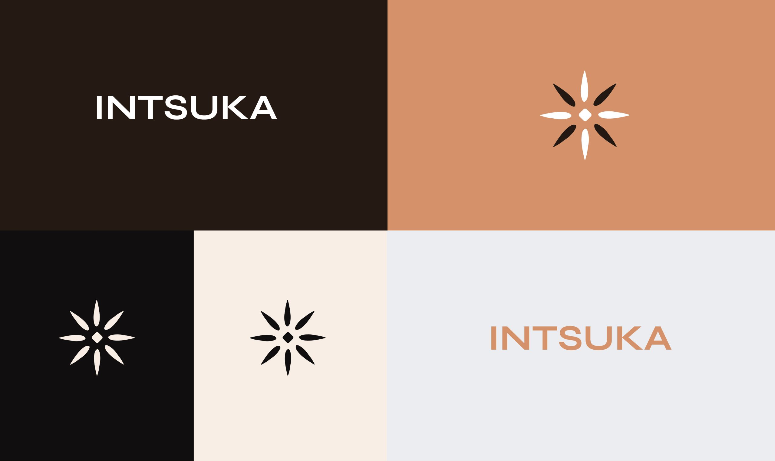
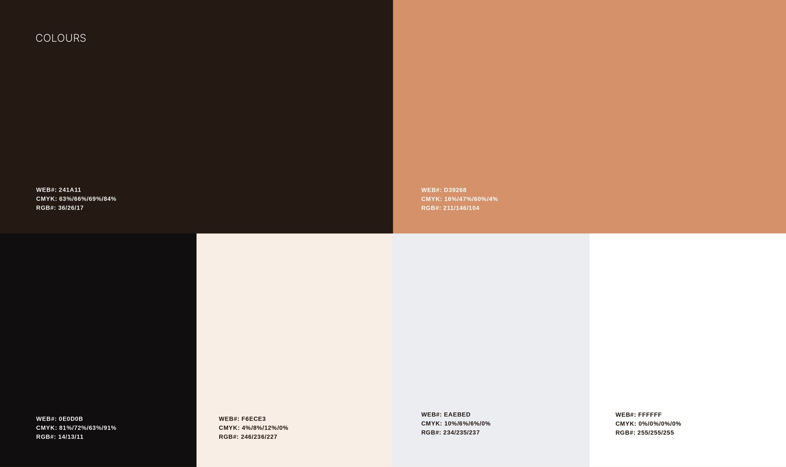
With this in mind, I got to work, exploring different ideas. A strong and striking design was needed here, and after multiple rounds, we settled on a symbol akin to a star or flower, with its parts radiating from its core. An earthy colour pallete and clean aesthetics round off this bold take on the company.
The Result
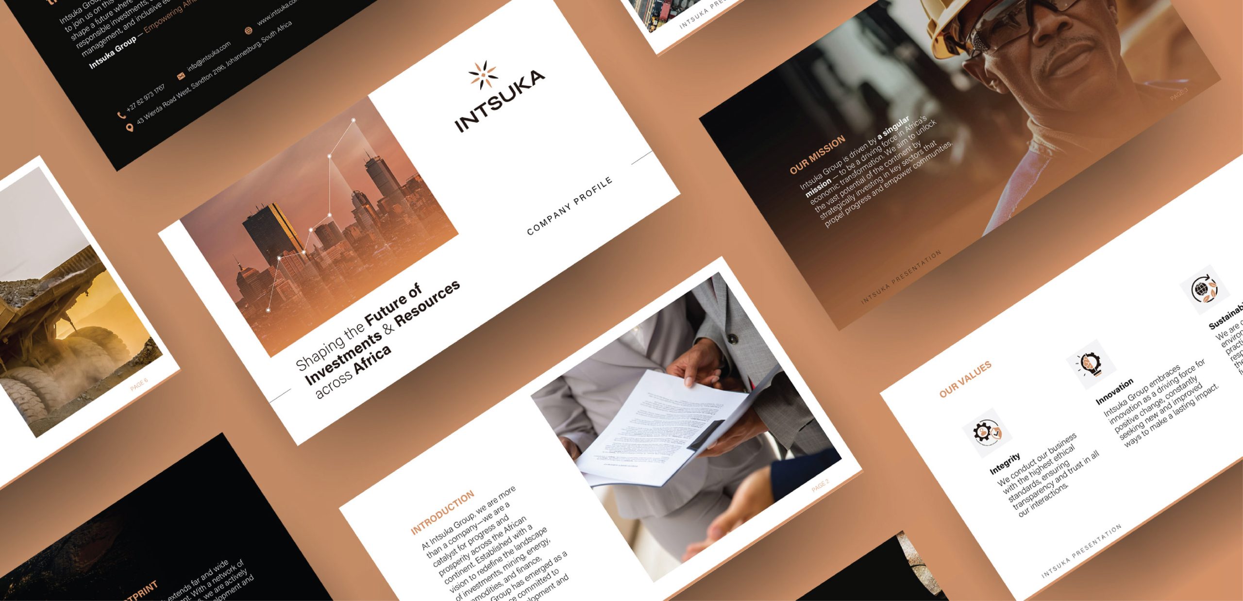
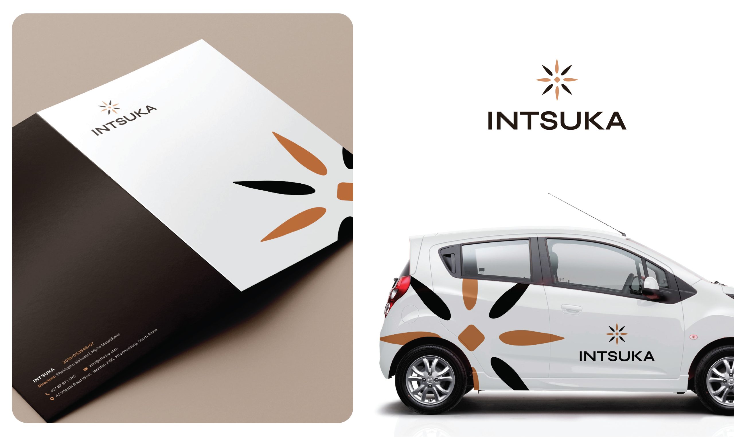
We expanded the identity to different pieces of collateral, creating business cards, letterhead, templates etc. Everything needed to launch the business with a professional face.






Subscribe to
