Health of Mother Earth Foundation Rebrand Case Study
Examining the roots of exploitation with HOMEf
The Challenge
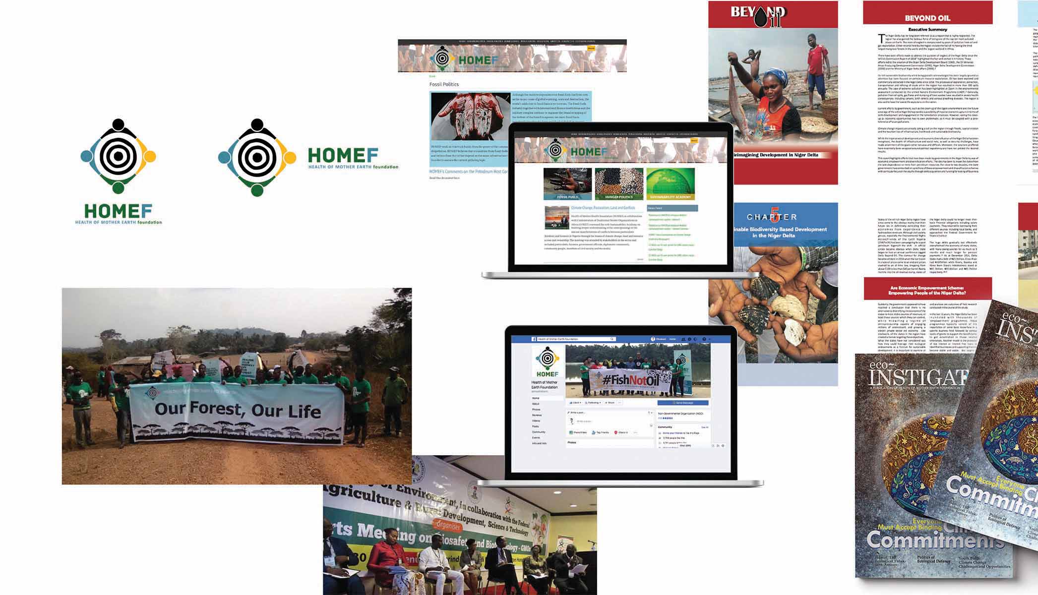
Health of Mother Earth Foundation had been operational since 2013, gaining international recognition and traction for their work in combating the ill effects of fossil fuels, GMOs and advocating for a more sustainable way of life in Nigeria, Africa and the world. Like most organisations in this space, there was a lot of work to be done on the design and identity front. Our mission was to refine the brand definition, as well as the brand identity, and build a visual system around it that would position it is an organization and force to be reckoned with. We also had to redesign and build the website to be more user friendly and intuitive to use.
The Outcome
We completely revamped the brand identity, building on the existing logo to create an ecosystem of touch points and designs that all come together cohesively to tell the Homef Story and help them gain even more traction with their work.
The Impact
HOMEf now has a beautiful and striking visual identity that comes through in its protest materials, magazine, reports and website that tell its story and communicates compellingly with its audience.
Services
Website Development
Layout Design
The Process
Defining the Brand
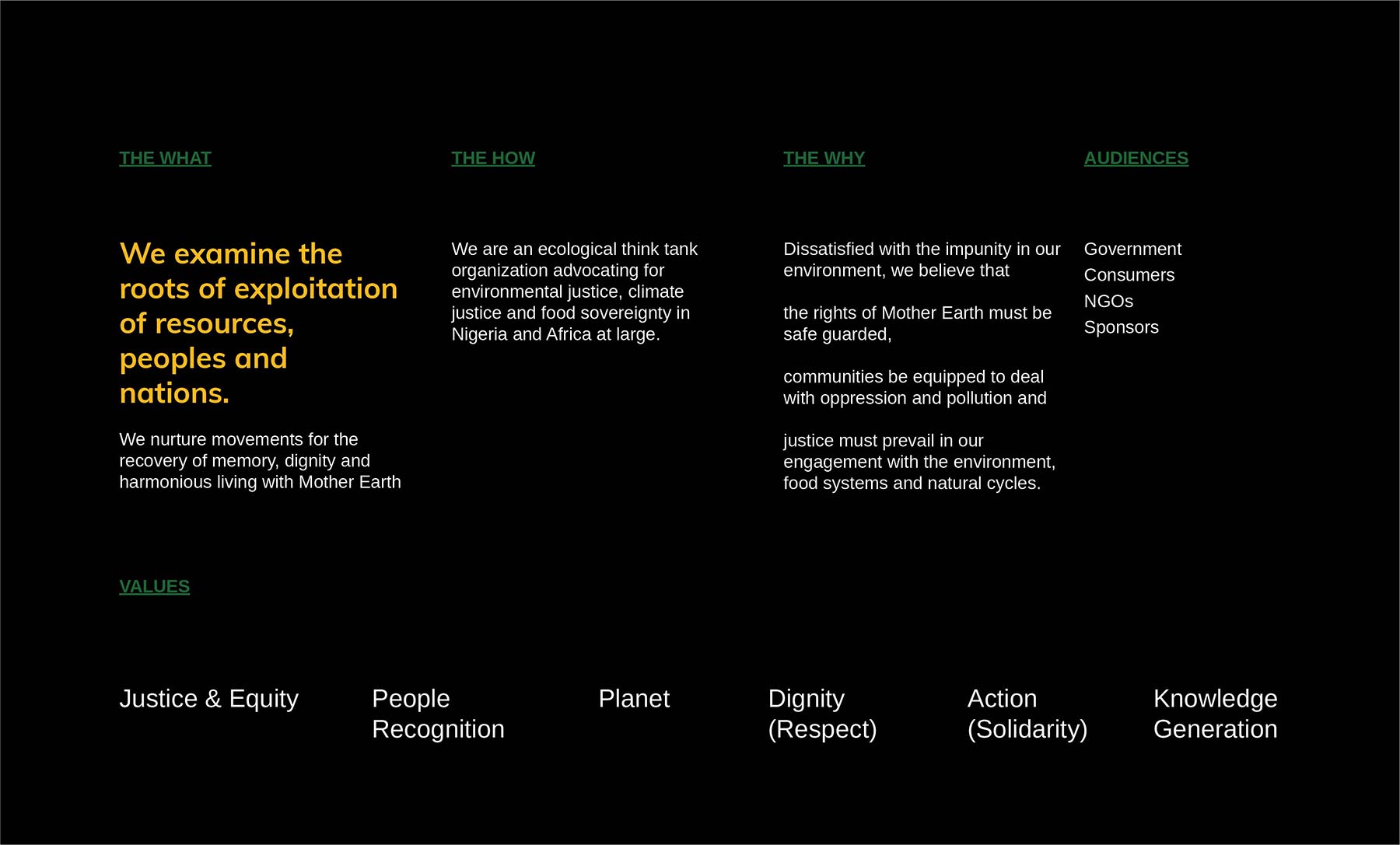
We kicked things off with a brand sprint, doing a deep dive into what the organization had done for the past 5 years. We wanted to know what they really did, and why it was so important. We also outlined the key stakeholders, the core values of the NGO as well as the main programme tracks. From our interactions, we defined the main thrust of Homef as this:
Examining the roots of exploitation of resources, peoples and nations. Nurturing movements for the recovery of memory, dignity and harmonious living with Mother Earth.
HOMEf is an organization that believes in the rights of Mother Earth, the need to equip communities to push back oppression and the need for justice for the environment, our food systems and natural cycles at every level of policy engagement. It believes in home-grown solutions over externally generated and imposed ideas and is firmly rooted in the ideals of solidarity and dignity.
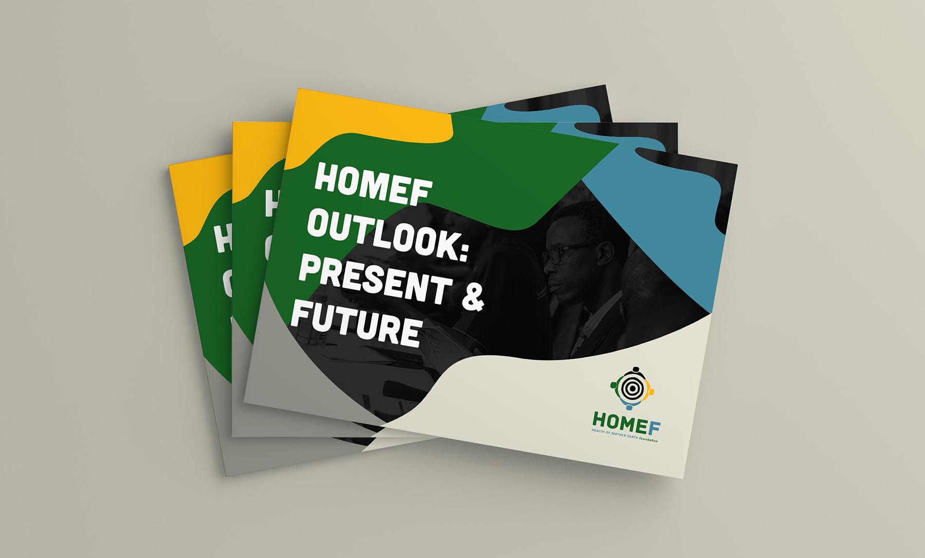
These ideas and core were distilled into an Outlook Document for the client to use in generating internal buy-in and sending a clear picture to external stakeholders.
Designing the identity
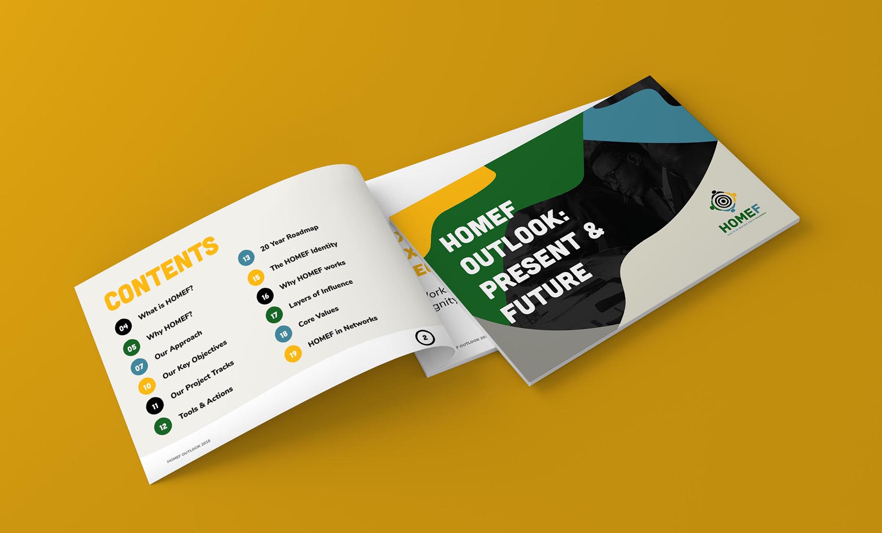
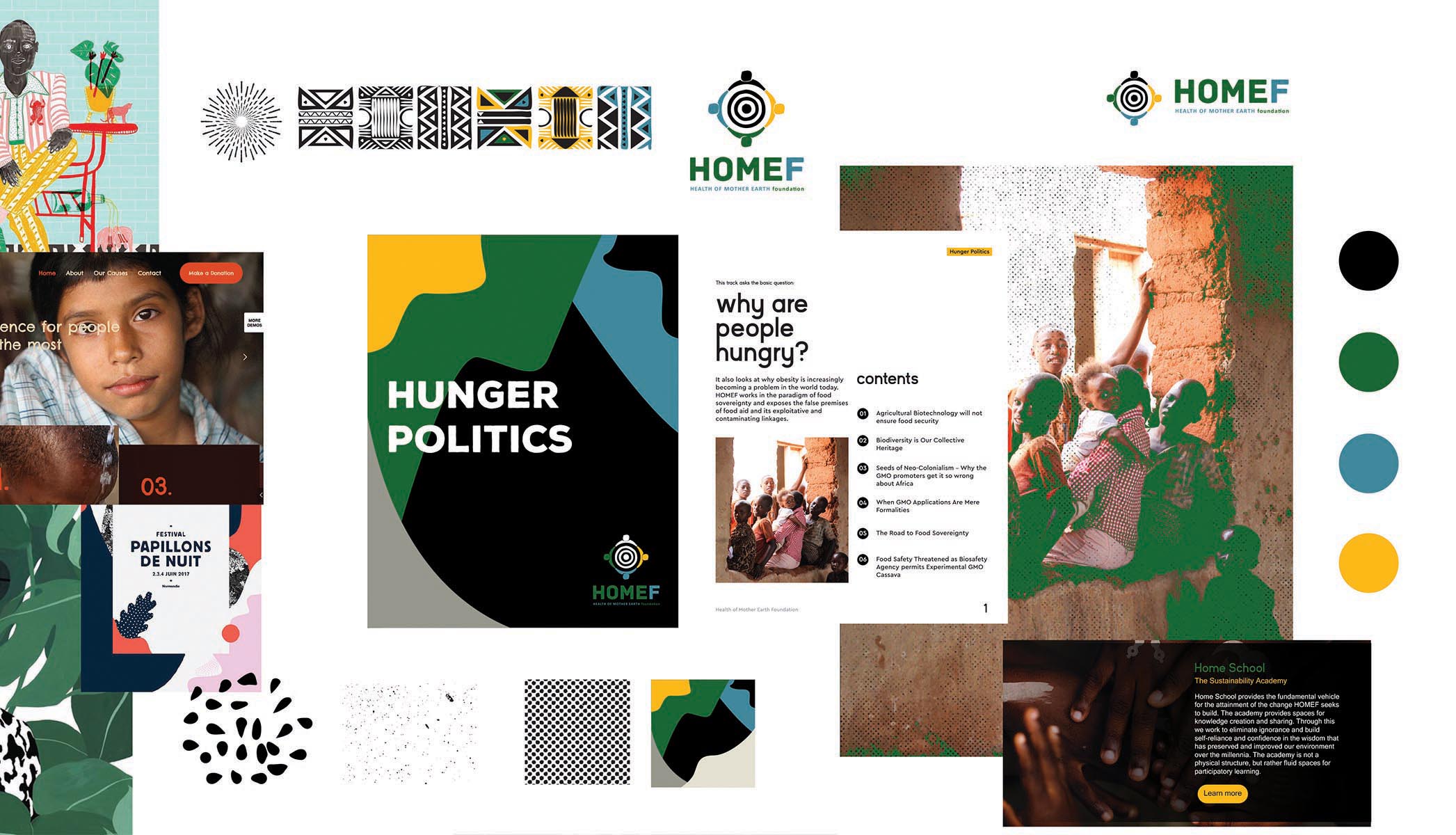
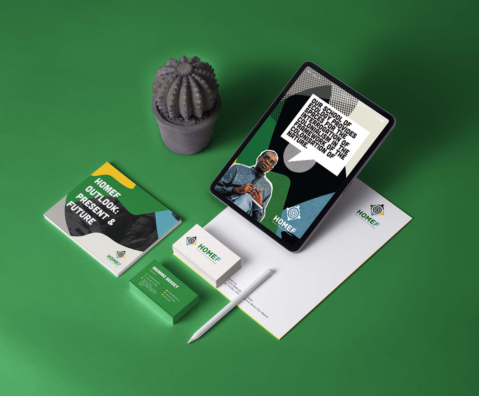
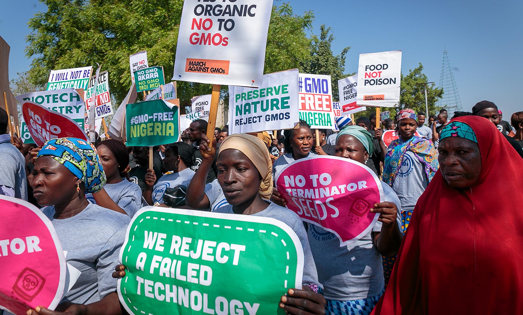
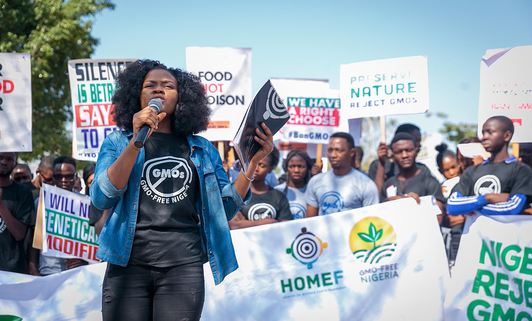
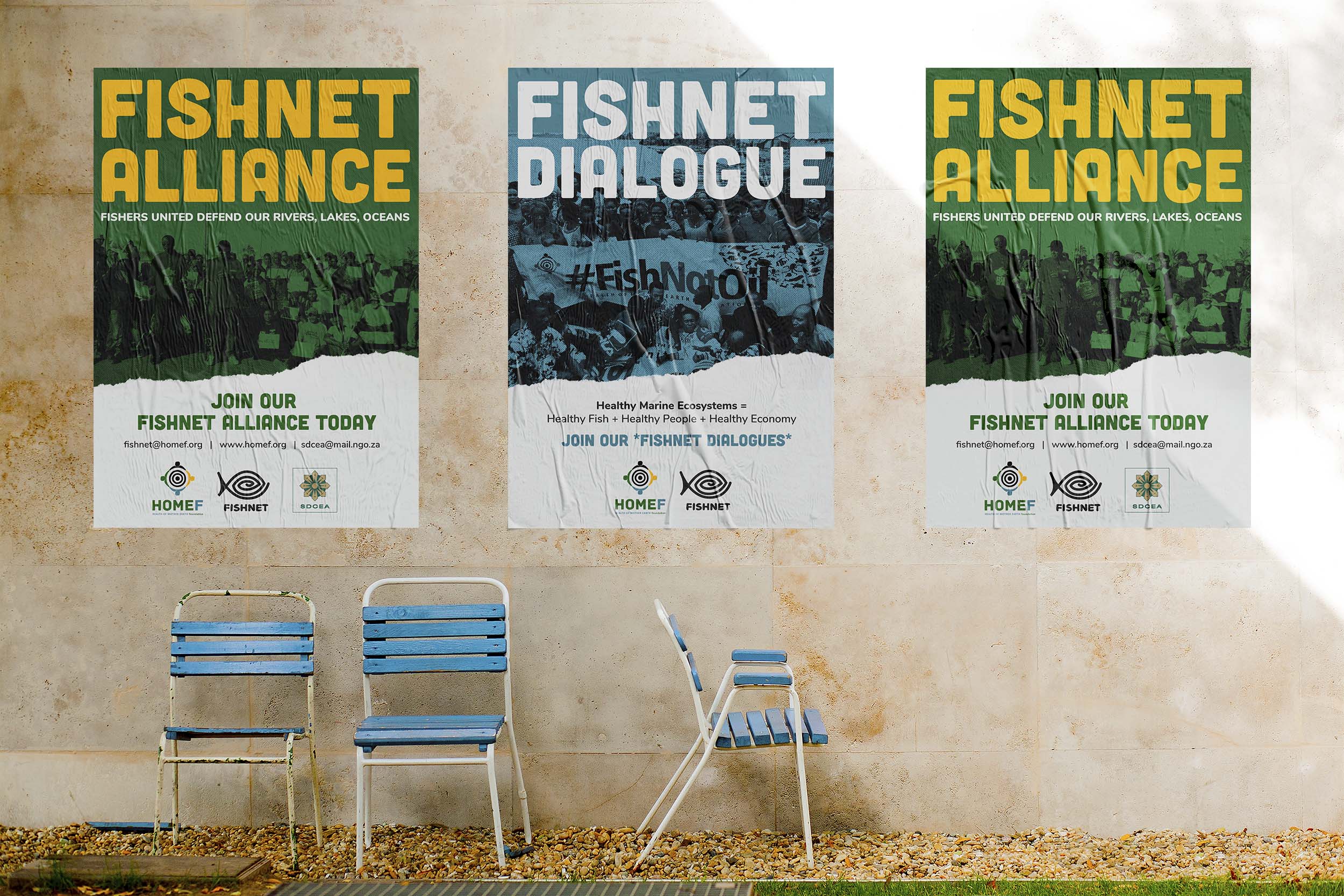
We refined the logo a little bit. Tightening up the lockups and adjusting the colour placement. Then we built the system on top of this. Using a combination of fonts, patterns and imagery to create a system that is dynamic but effective at every level. We designed everything from stationery to protest materials and reports.
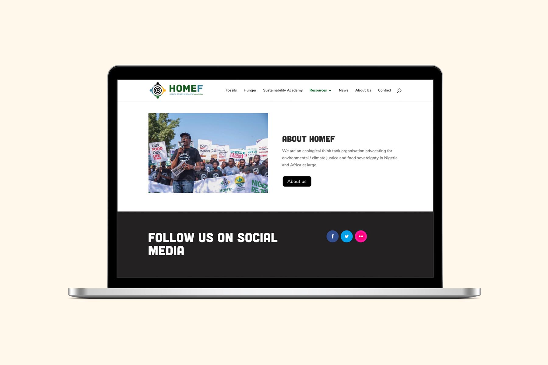
Creating the Website
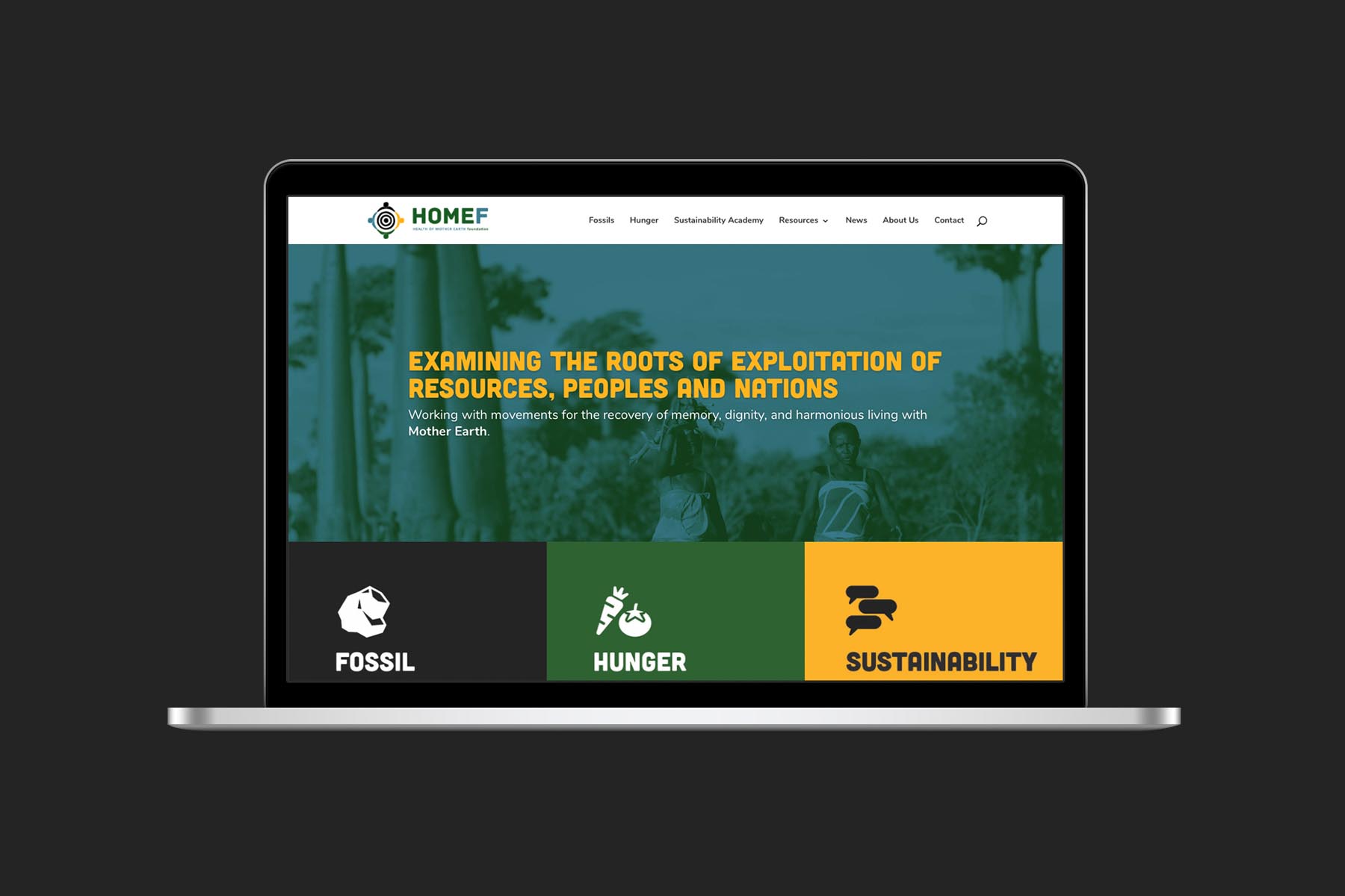
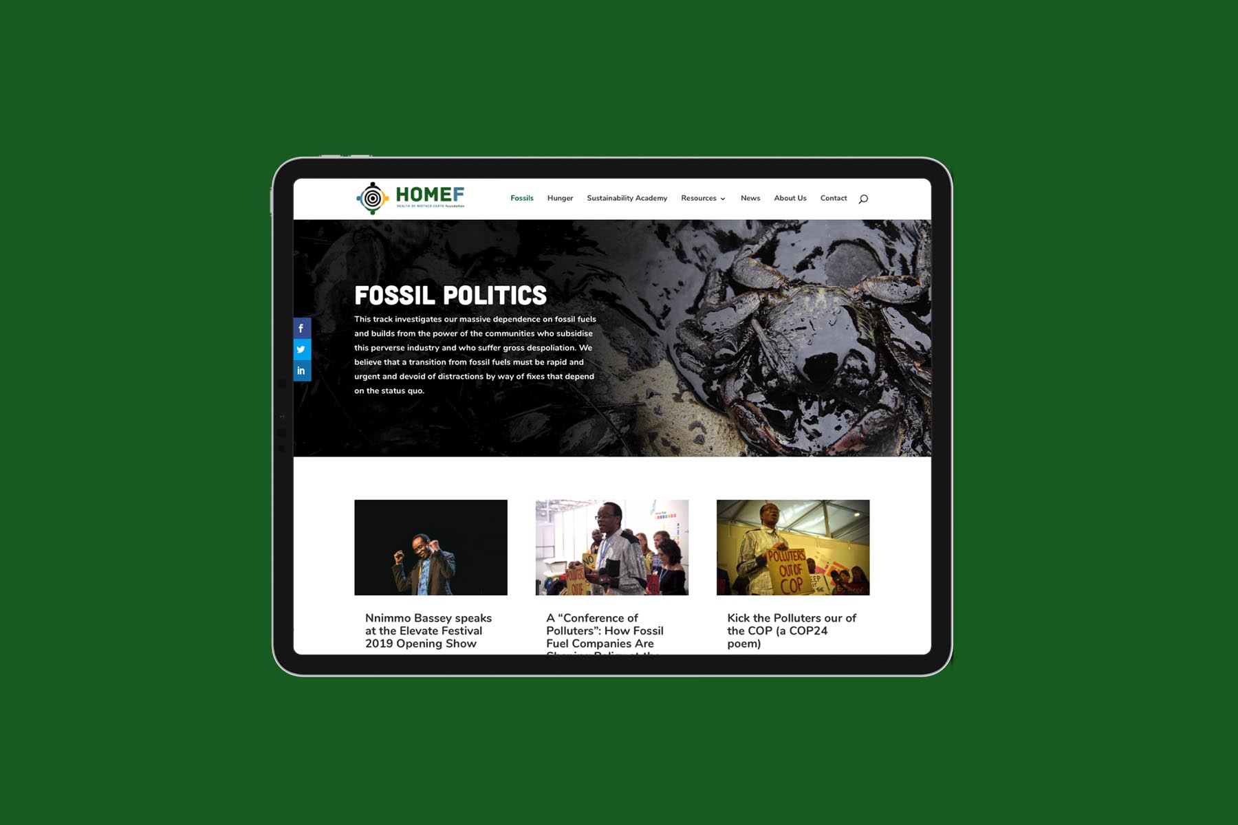
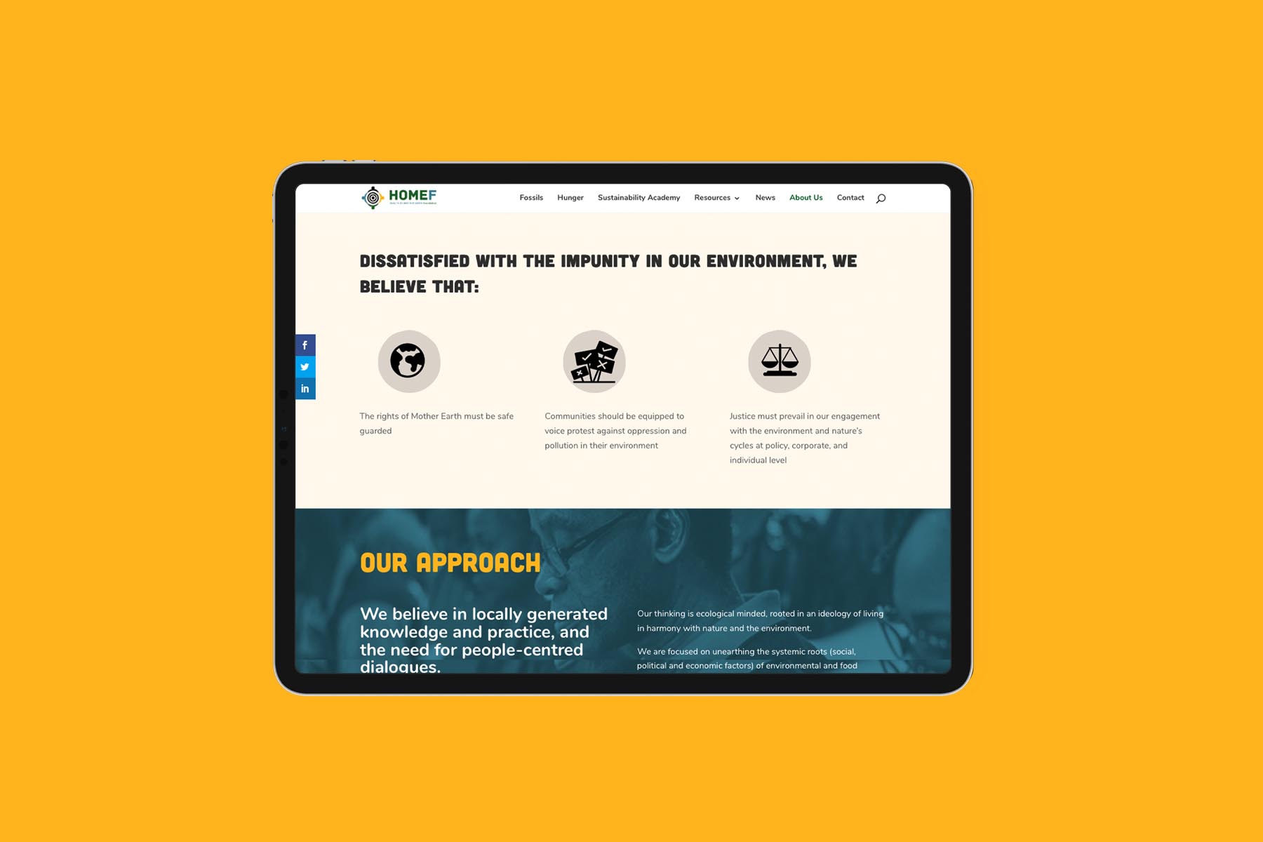
A key need of the project was the new website. We did an audit of the old one, accounting for the all the existing content including publications, reports and downloadable assets. Using our process, we re-arranged the way information was presented on the site and designed an experience that is user friendly, aesthetically pleasing and intuitive to use.
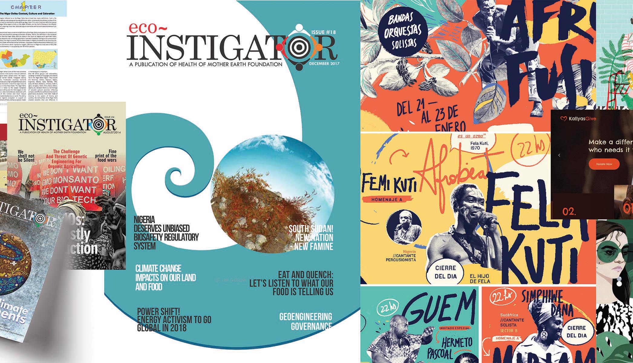
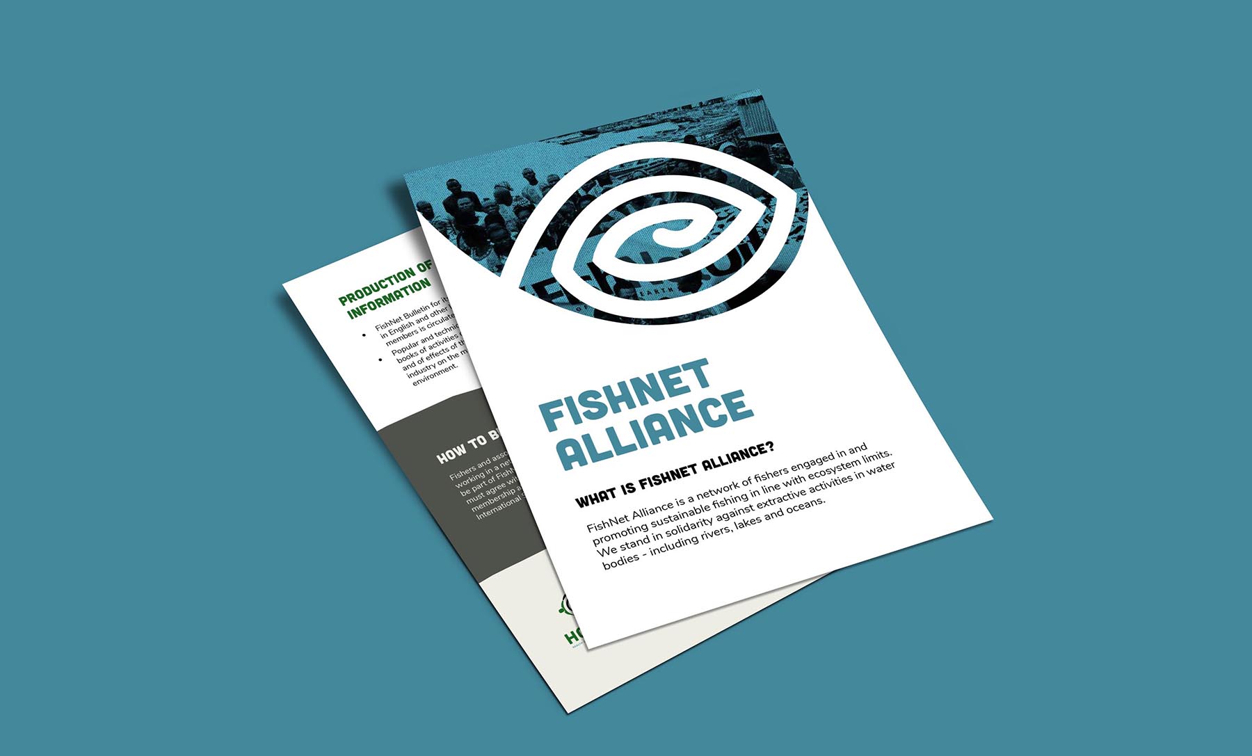
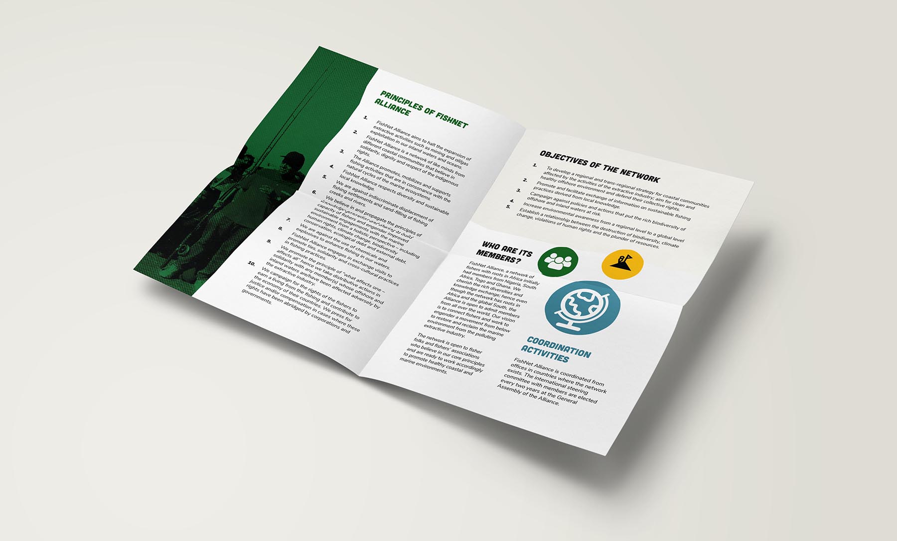
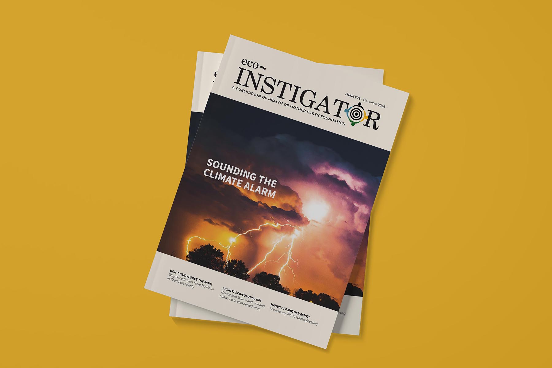
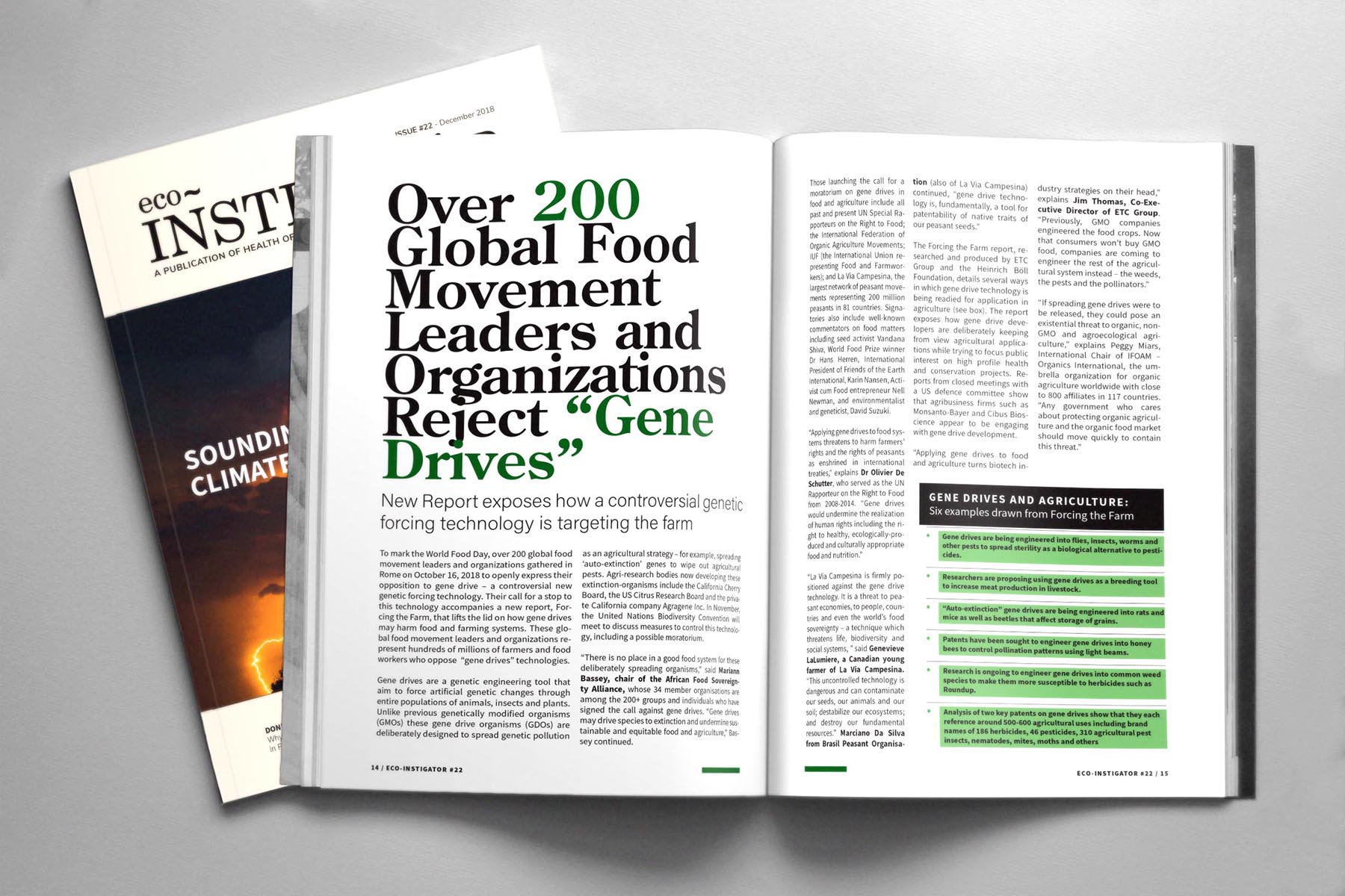
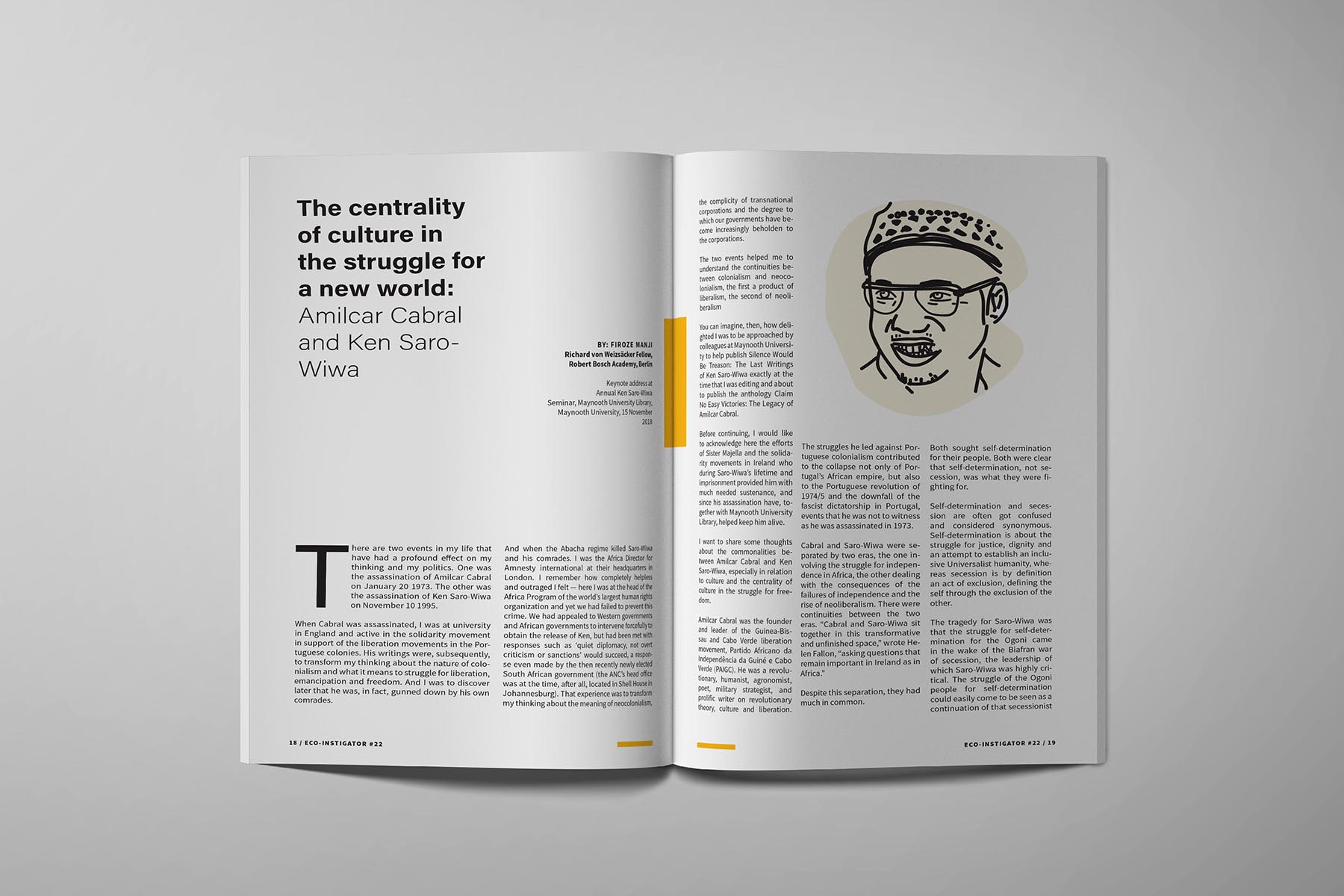
Designing Publications
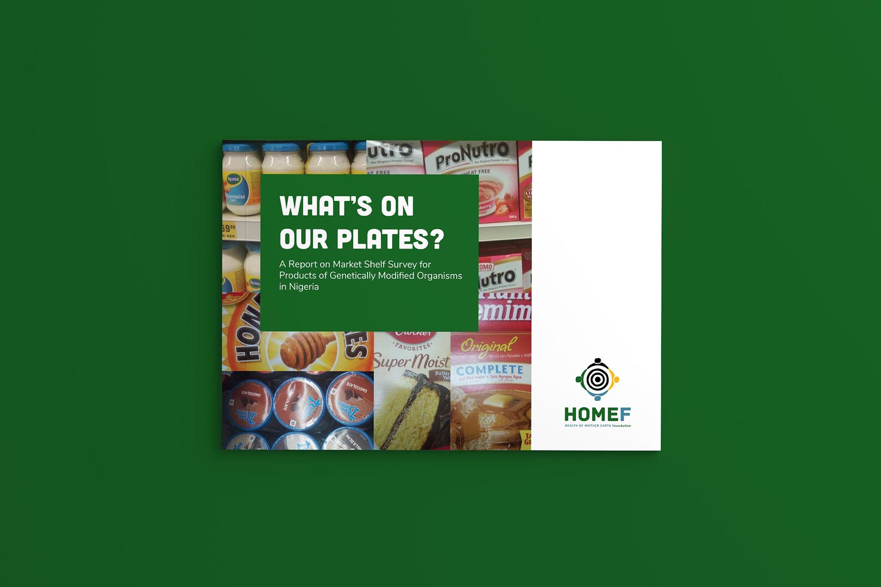
We also reviewed collateral such as reports and magazines and refined them also. Updating them with world class design principles to present a look that begs to be read.

Subscribe to
