Dv8 Technology Group Rebrand Case Study
Enriching work, life & play with Dv8
The Challenge
Dv8 Technologies was ramping up to celebrate their 10th year in the ICT space, and that seemed a good time as any other to take a look at their positioning and branding. They had reached a crossroads and wanted to take their business into new territory, expanding their clientele to serve new market segments. Our mission was to interrogate the existing brand, tease out an encompassing vision for the future and revive the identity to reflect that.
The Outcome
We workshopped the client to drill down and understand what the Dv8 brand was all about, working through competing tag-lines and ideas accumulated over the years to one clear idea that could be driven into the future. We refined the logo mark to a cleaner, stronger, more precise form, and rolled out a restrained but striking visual identity.
The Impact
The story of Dv8 continues to be written, as shortly after the brand exercise, we embarked on much longer indepth journey with Stanford Seed to innovate the business model and chart a path into a bigger and more sustainable future.
The Process
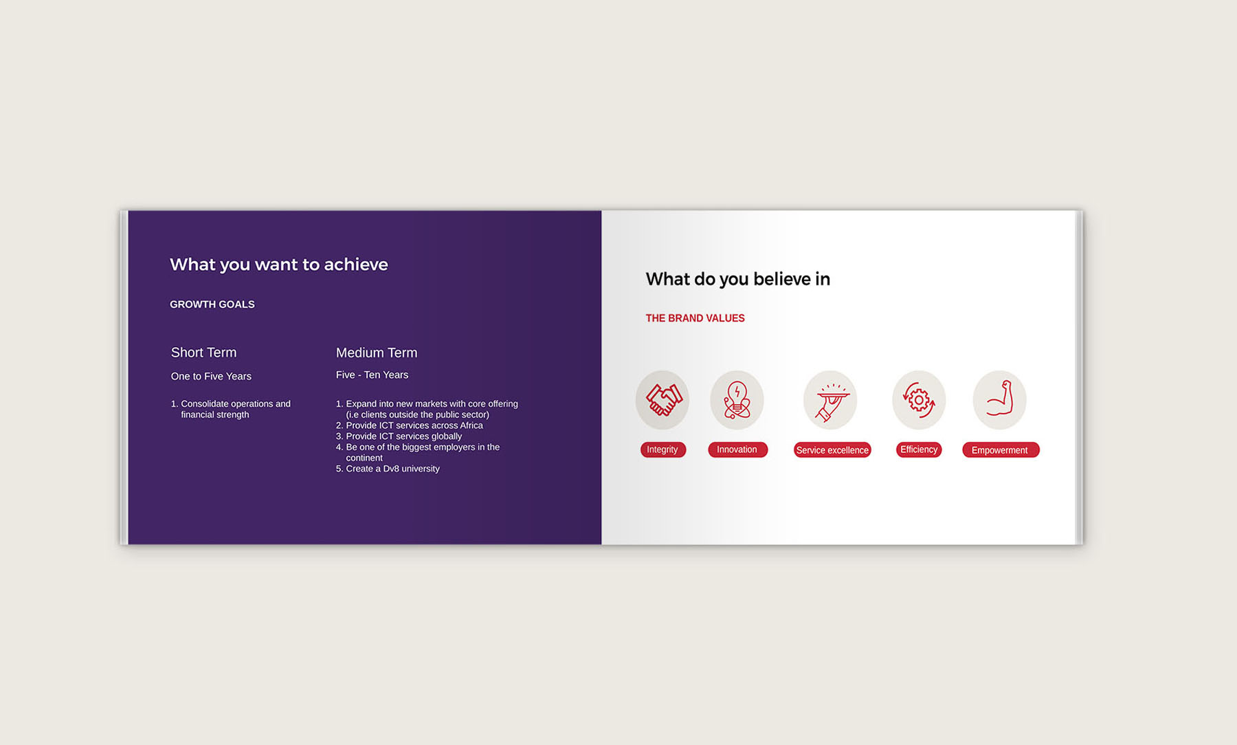
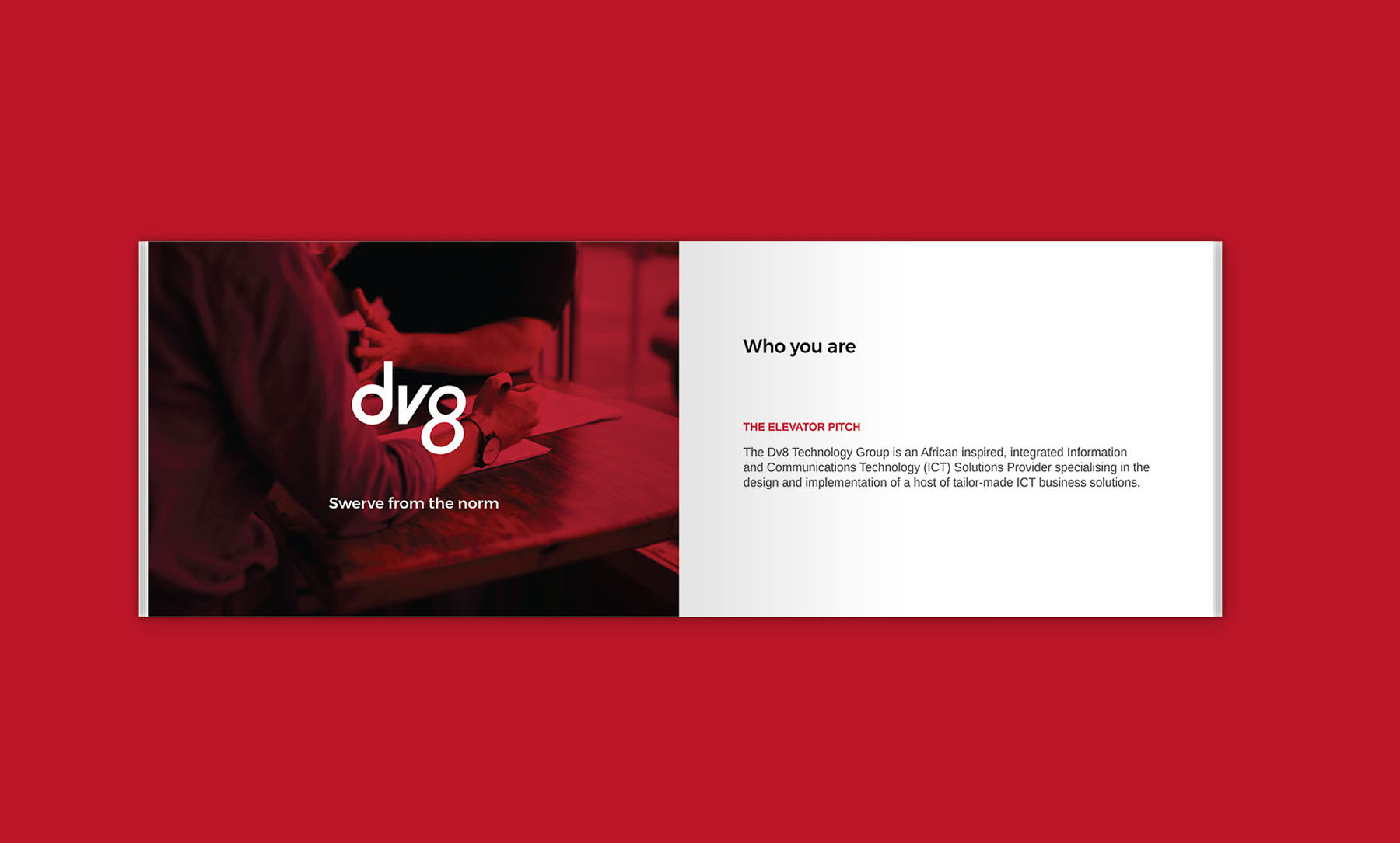
Defining the Brand
It is interesting how people can work together in a company for a long time and still find it difficult to pinpoint for sure what the company does. This is more common than you think and was certainly the case at Dv8 Technology. The first task we had was to dig in and articulate clearly what the company did and who it served.
The ICT space is quite broad, and companies like Dv8 develop a wide range of capabilities and services to capture as much market share as possible. How do we tie all these disparate things with a golden thread that communicates a key thrust of the brand.
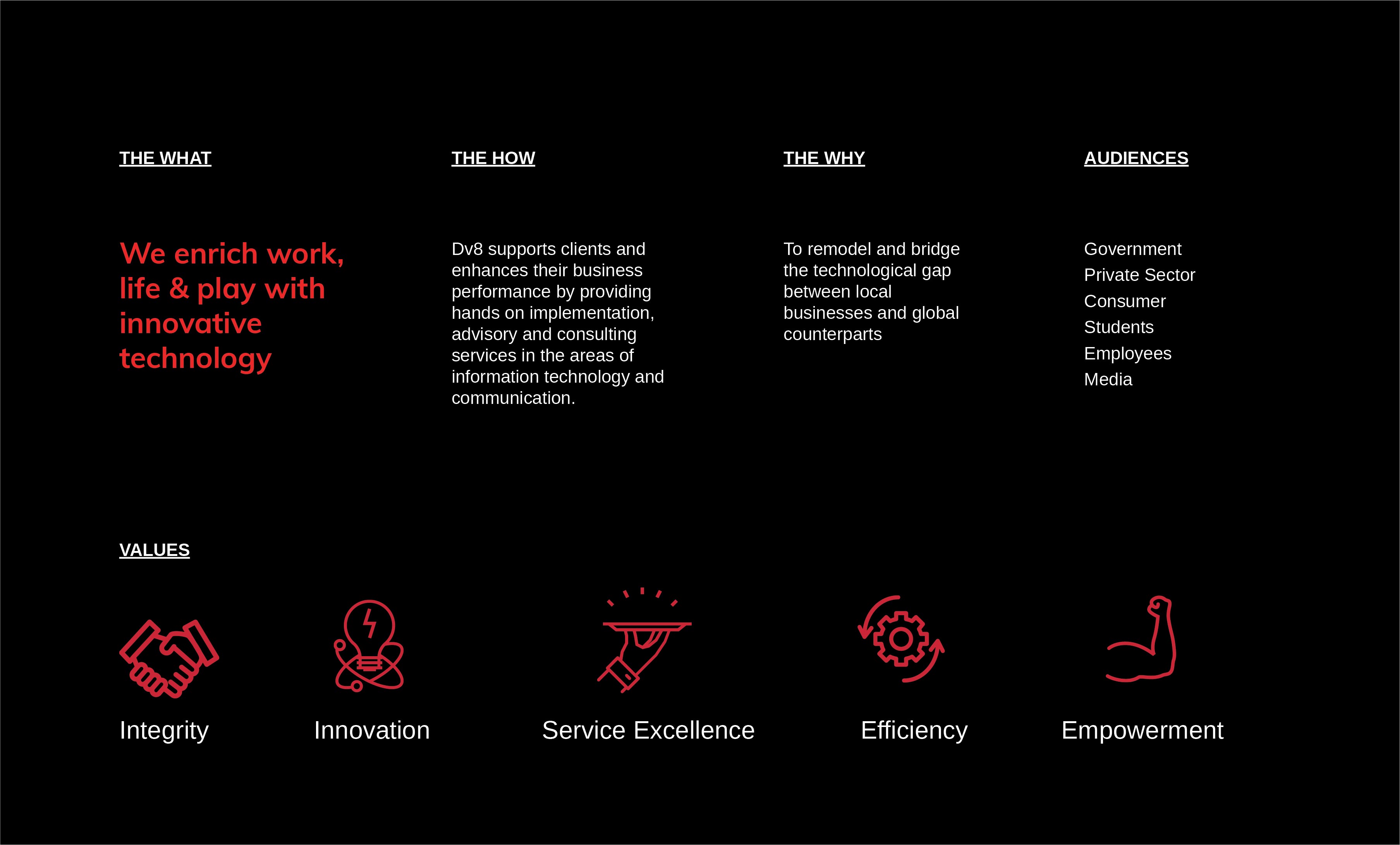
We dug deep and unearth the idea of enriching work, life and play with innovative technology. This was the core and essence of the Dv8 brand.
With a tag line like ‘Swerve from the Norm”, Dv8 always stood for innovation and deviating from the standard or mundane. Boasting world class facilities and equipment, with a vision of an empowered Africa and home grown solutions, the company renewed its commitment to the vision of swerving from the norm to change how communities work, how technology is perceived in the continent and the development of world-class talent.
Designing the identity
There was a lot of equity in the existing logomark. It was unique, approachable and gave the feeling of movement and innovation. However there were limitations and concerns with it.
- The 8 for one looked more like a g than and 8 and caused confusion with clients
- The bowed strokes on the ‘v’ complemented the bowl of
the ‘d ’ but left anakward empty space between the two letters
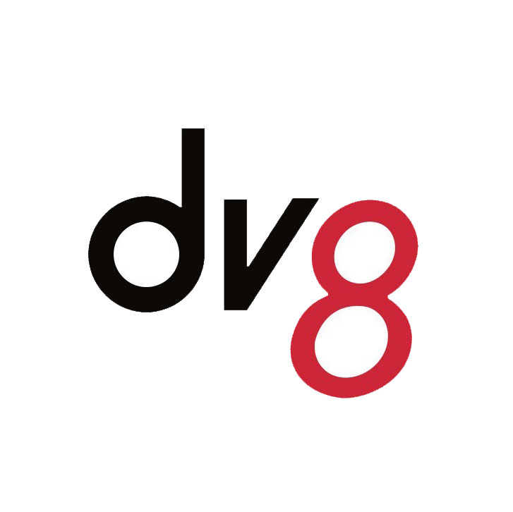
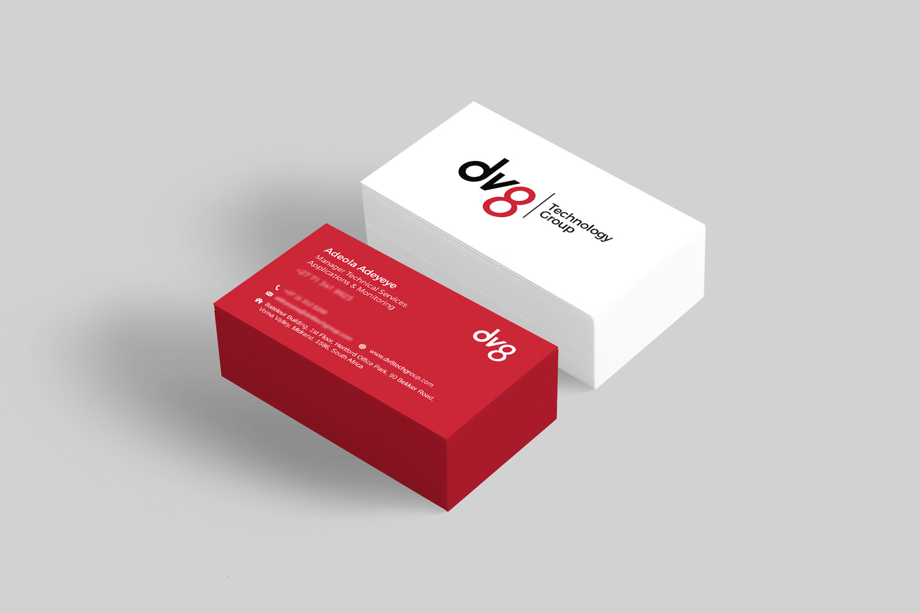
To address these concerns, we went through a few iterations, evolving and pushing the logo further to a refined state.
- We closed up the ‘g’ and did away with the stroke to give a clear ‘8’
- We refined the ‘v’ to align with the ‘d’ on one side and the 8 on the other
- We refined the bottom of the ‘d’ to complement the curves of the ‘8’
The result?
The result, a strong, clear beautiful mark.
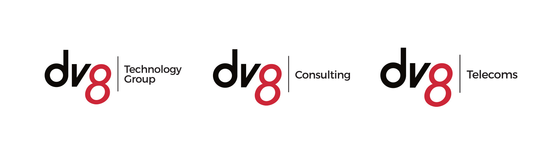
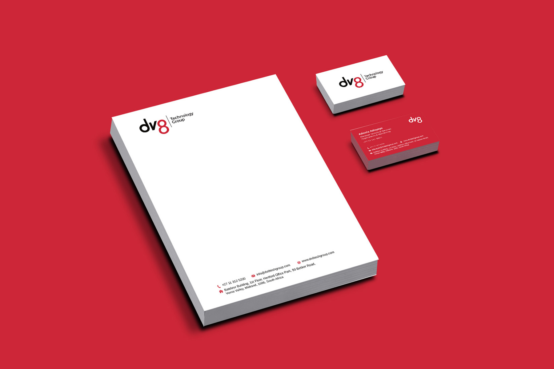
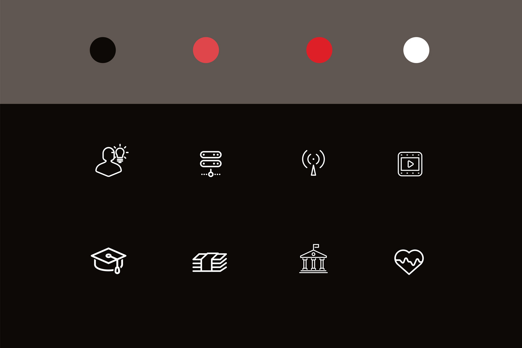
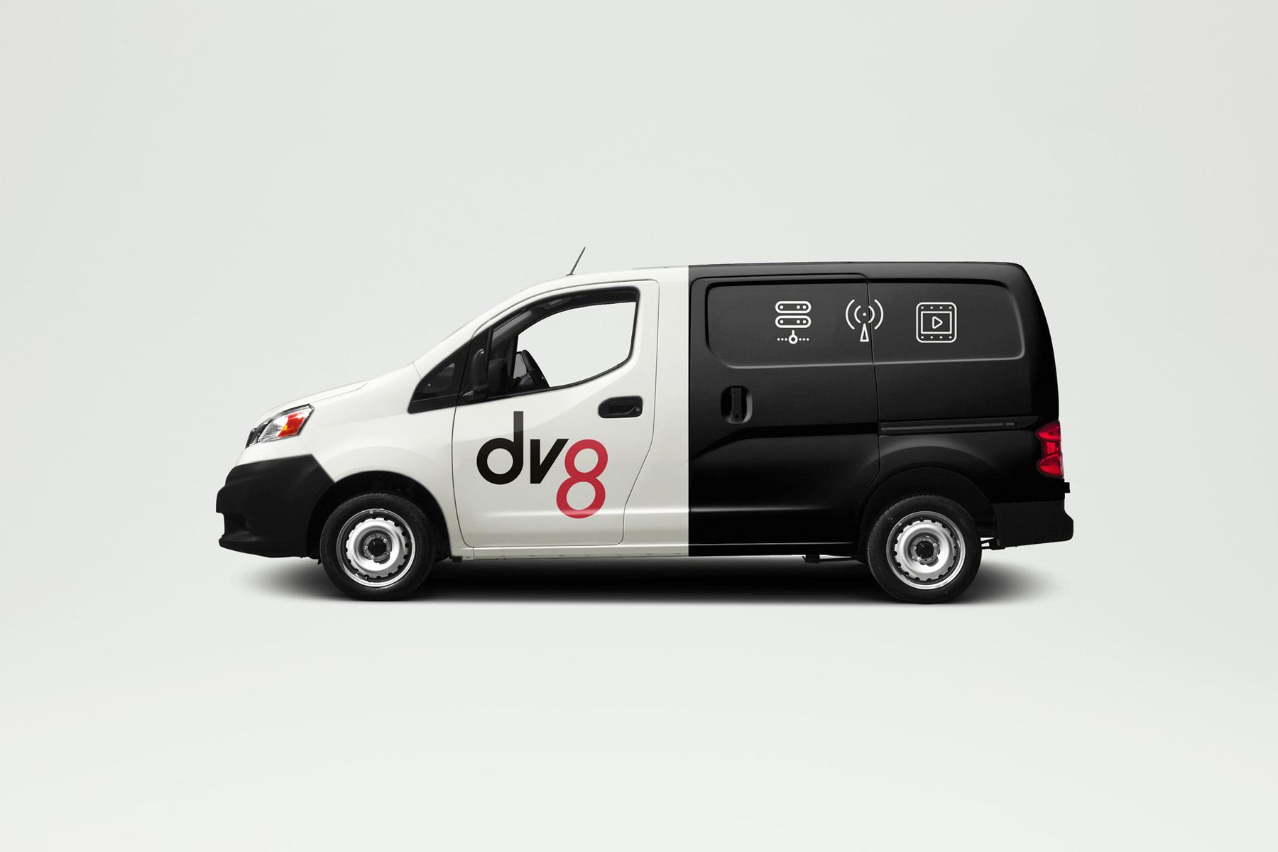
The Buildout
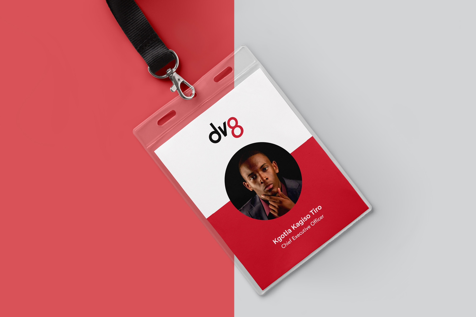
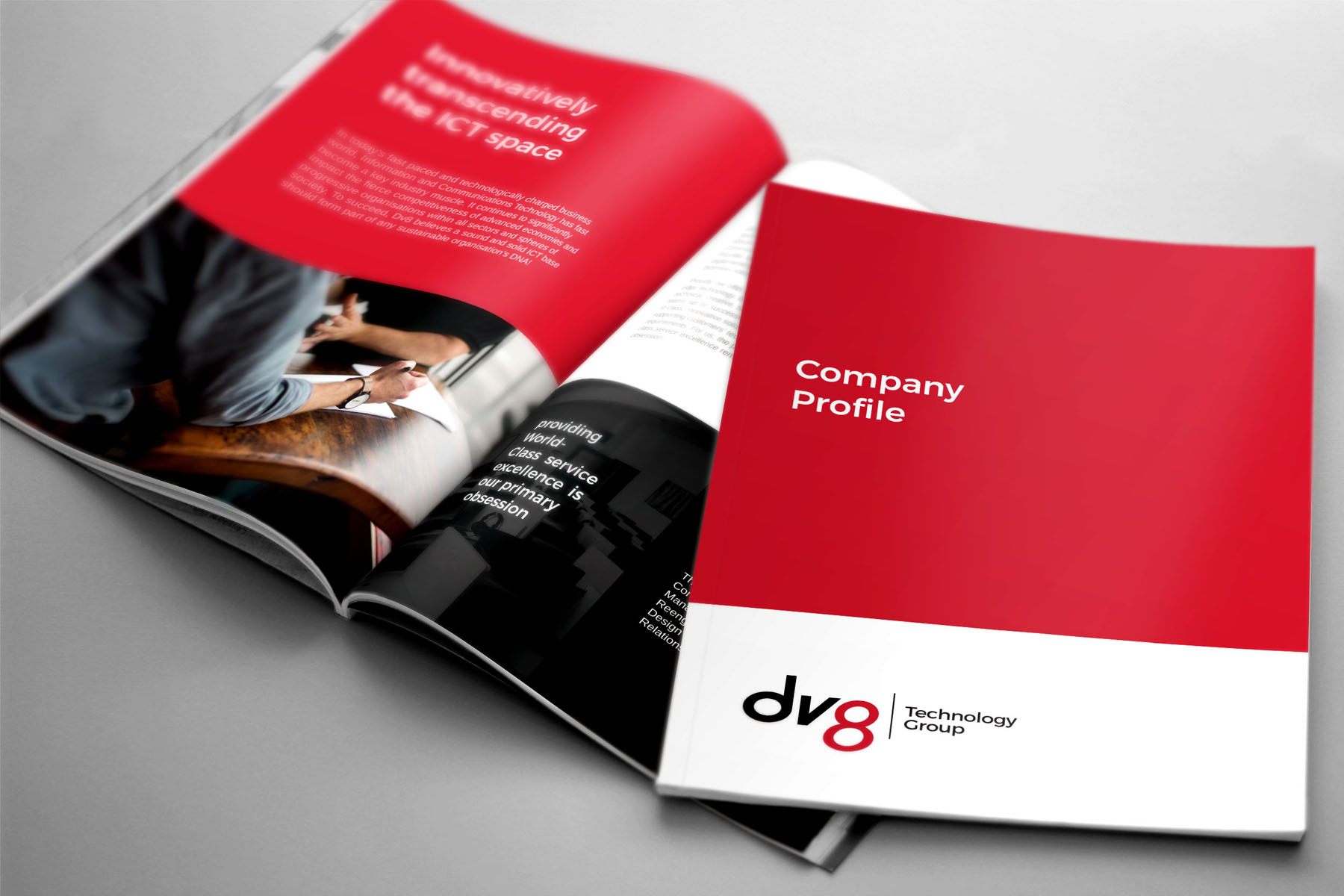
From this point, we built out the identity system, applying the new look and feel across the different collateral and touch-points for the client to use moving forward.
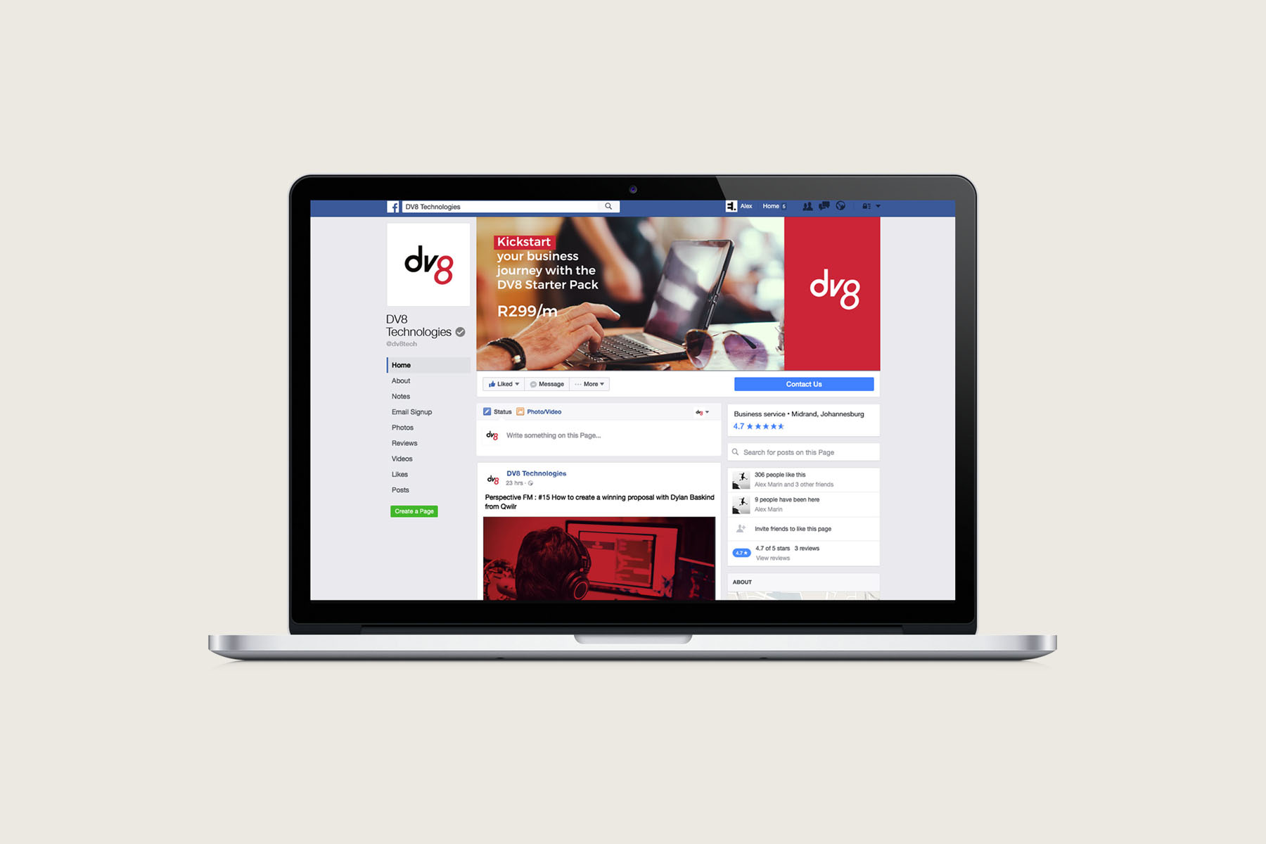
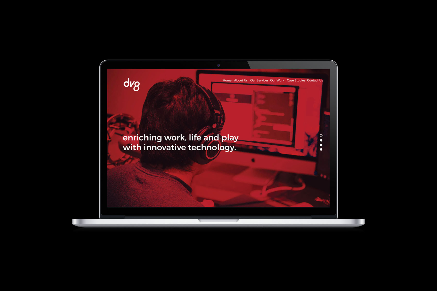
Creating the Website
When Dv8 approached us, they had not had a website in a while. There was a sore need to get something designed and up and running as quickly as possible. We used our website design process to understand the user needs, develop site maps and structure, create the wireframes and layouts that would eventually be developed and deployed on the web.

Subscribe to
