When my friend Tsikwe approached me to design the brand for his craft beer, I was surprised and excited. He had taken up home brewing out of curiosity and for fun. Now he was ready to make it a real thing.
We discussed the brand for a while. We agreed we wanted to create something fresh and fun, but not something too young that it alienated older drinkers. The craft beer scene especially in SA is characterized by bold and conceptually strong design appealing to ‘hipsters’ and ‘those in the cool’. Which is great and allows for a lot of exploration, but as the urban black demographic slowly adopts into the craft beer culture, we needed something that could bridge the gap between the core group of craft drinkers and those trying it for the first time.
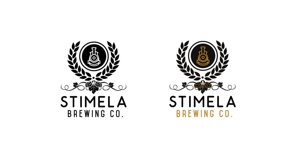
Stimela essentially means ‘train’ and speaks to black pride, the idea of journey and struggle. The trains that took migrant miners away from their families to work in dangerous conditions far away came to mind. We thought of all the great leaders and the sacrifices they made. We looked forward to new ideas of reinvention and making things that last. Tsikwe proposed the core tenets of – Legacy, Passion and Excellence as brand pillars. With all of this in mind I turned to playing with ideas and trying to define the Stimela aesthetic.
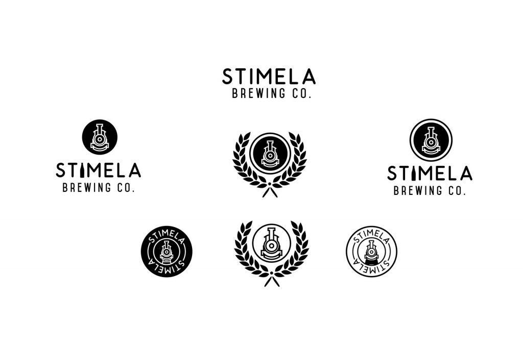
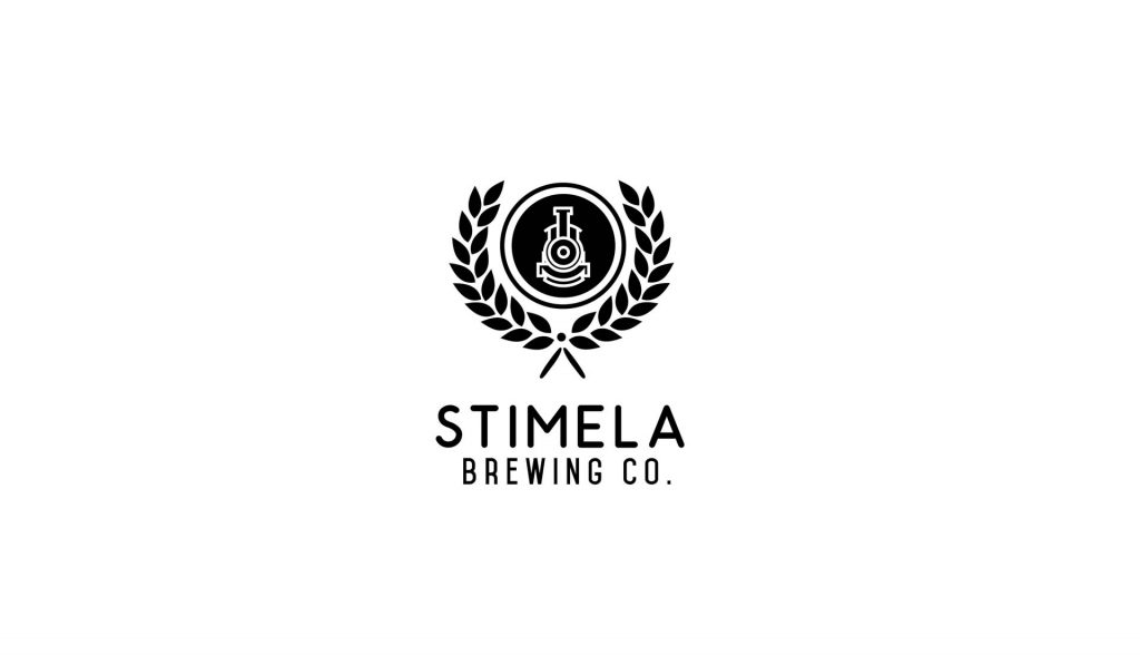
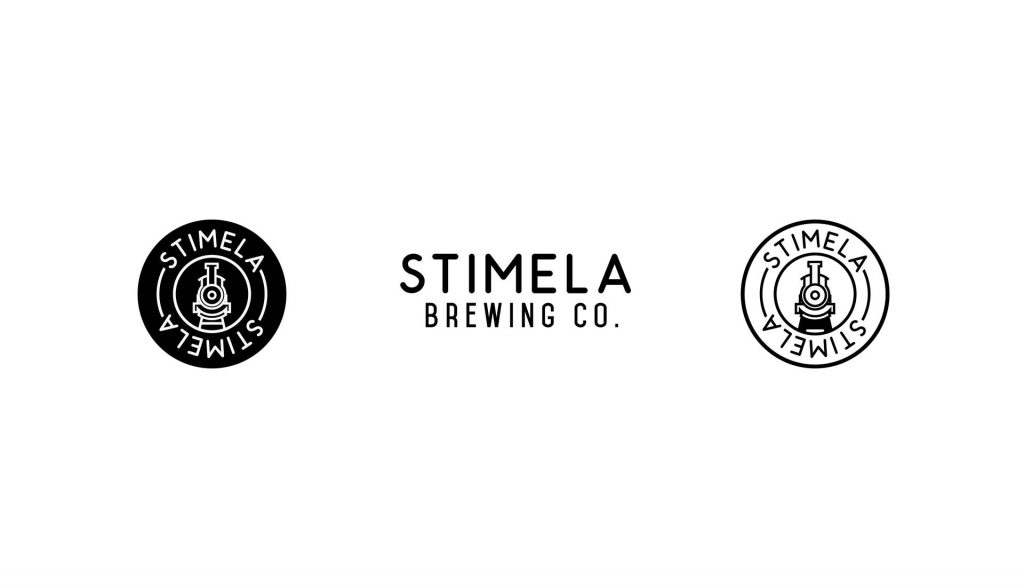
One of the first ideas was around the concept of legacy. Thinking of family crests that convey history, meaning and pride, I played around with ways to represent Stimela with a crest / coat of arms.
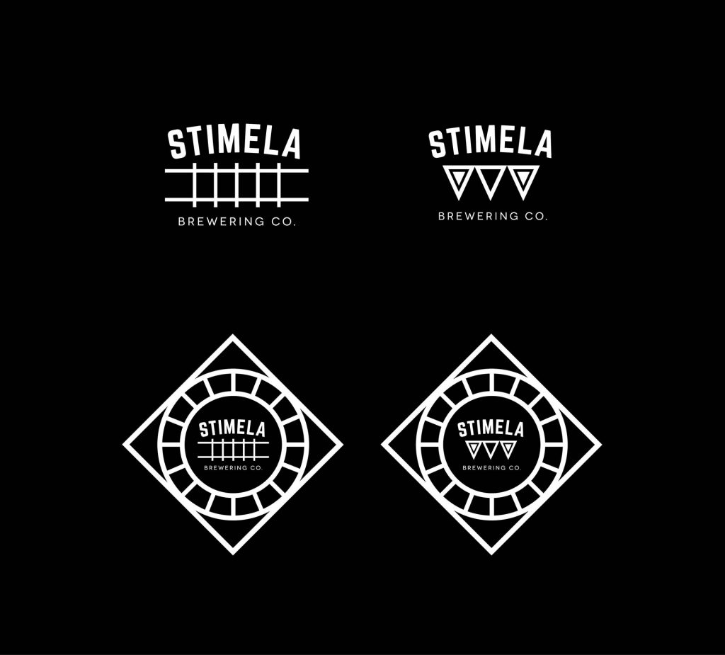
We explored another set of ideas combining a clean aesthetic with railway and African geometric patterns.
We deliberated back and forth on the options and leaned more to the first idea – the crest. After a few iterations, we added some flourishes, some hops to speak to brewing and finalized the logo.
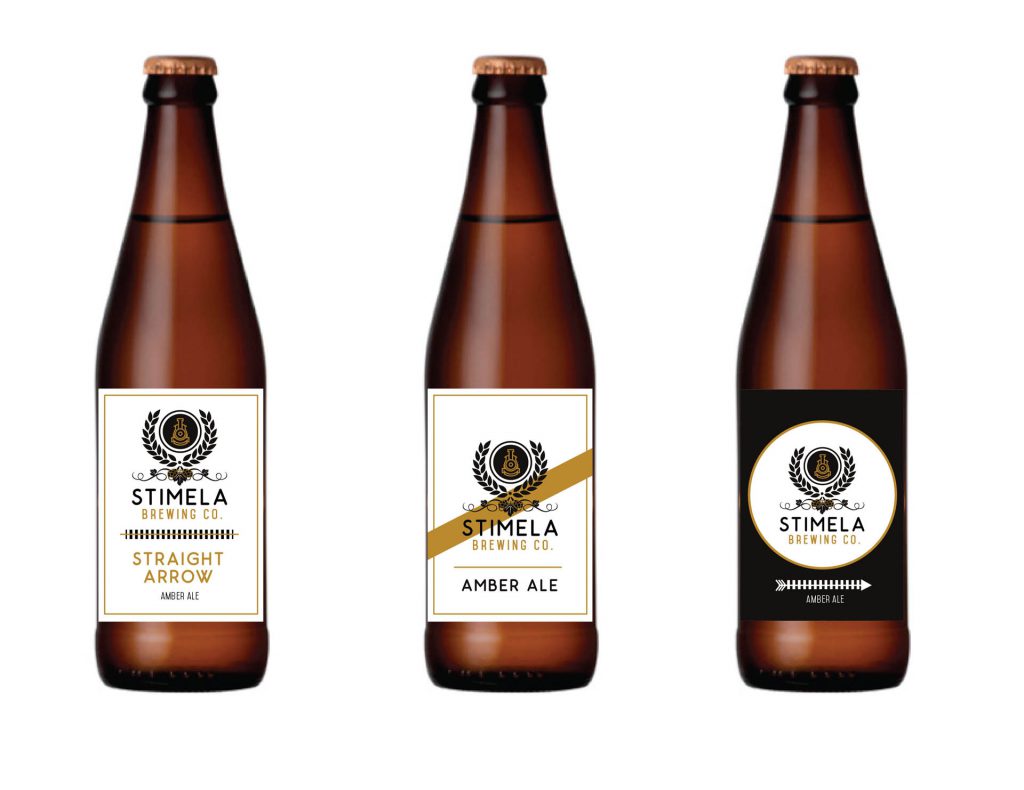
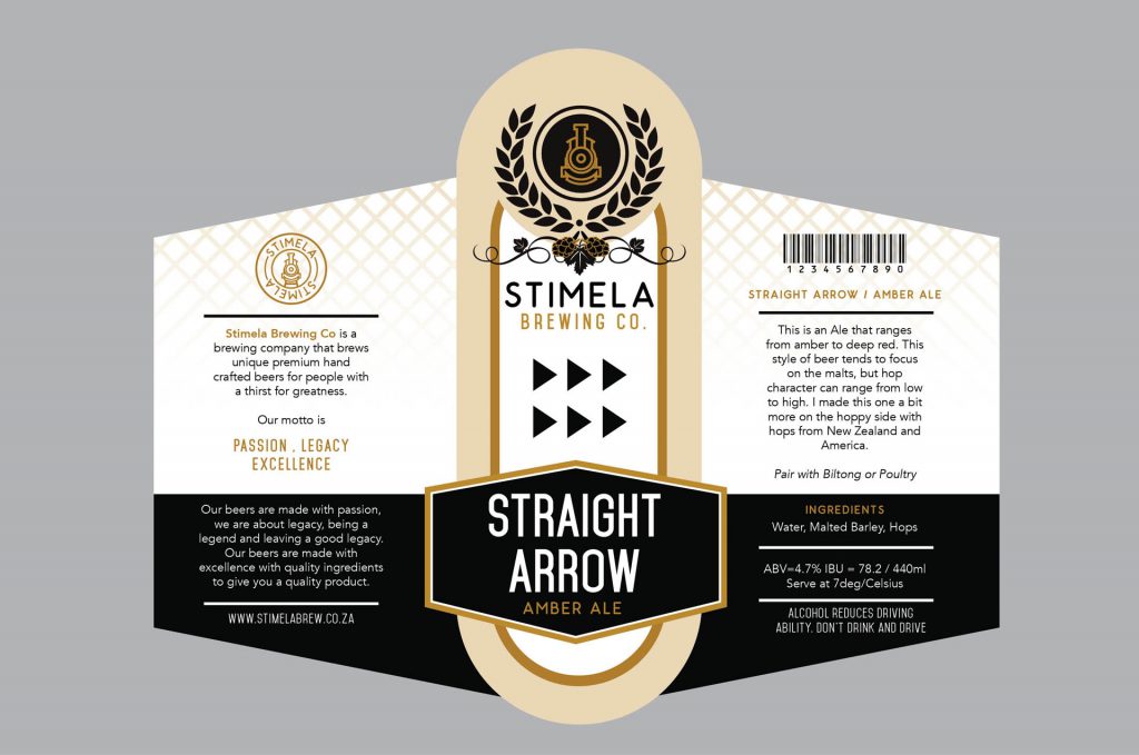
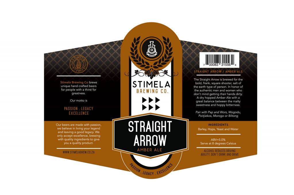
With the logo chosen and refined, it was on to the label design. Many options and ideas were explored. I drew from the idea of train tickets and simple upscale design to communicate the brand.
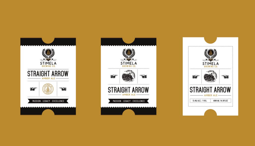
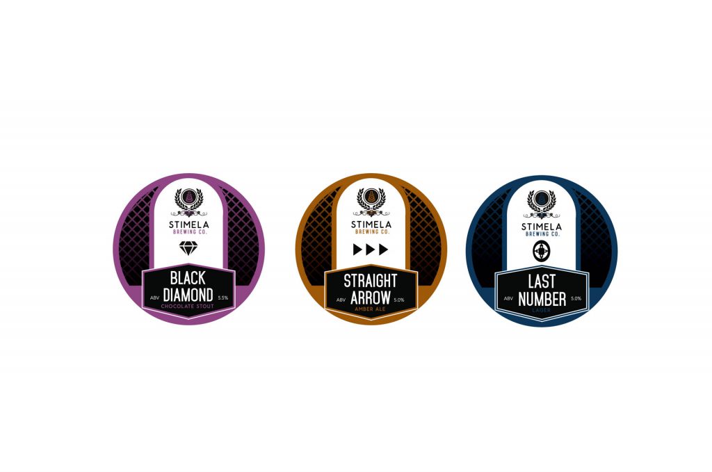
Our breakthrough came from a sketch from Tsikwe (like I said, he’s secretly an artist), and that set the tone for the labels. The design would feature a central ‘jukebox’ panel with wings on each side for information on each beer. Over time we refined the designs differentiating the flavors by use of color and iconography.

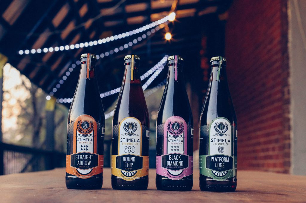
Working on this brand has been tremendous fun, and we keep thinking of new things to do and new ways to push the brand. It’s fantastic working with a client who has a strong vision of their brand and is open to collaborate to get the best result. Seeing the brand grow beyond just the collateral to physical objects (bar, beer taps, etc) has been very fulfilling.